Is Transit Just an Overlay?
We’re all familiar with road maps. Â They generally take a somewhat 1:1 mapping to a satellite image, removing obstacles like parked cars, trees, and buildings. Â It lets us cleanly see where roads go and how to get from one place to another. Â Online mapping services, from Mapquest to Google Maps, use a scaling model: when you’re zoomed out, you only see major roads (like highways). Â As you zoom in, major throughways appear, and finally small alleys.
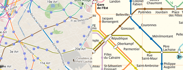
Transit maps, in contrast, have been painstakingly designed over the years to be simple and legible, promoting comprehension and clarity over physical accuracy. Â This provides a wonderful way to navigate a transit system. Â Google Maps recently added their own transit overlays, but are forced to map them to the real-world accurate locations, not the representations.
Above, you can see the difference. Â On the left, Google Maps shows metro lines in Paris as overlays on road maps, while on the right you see the RATP‘s rendition of the Paris Metro. Â It’s clear that following the lines on the left quickly becomes confusing, as it provides us with a level of detail that isn’t relevant, assuming we know where we’re going. Â The map on the right is clear, concise, and easy to follow, but you must know what stop you’re going to.
In a transit-oriented city, businesses and individuals always give directions based on their closest transit stop. Â This makes figuring how to get somewhere simple: while there are tens of thousands of intersections in a city, there may be only hundreds of transit stops. Once you know you’re headed to Goncourt, you know what to do to figure out how to get there, without needing to ask Google.
 While rail-based transit maps are very familiar in cities around the world, many cities, particularly in America, suffer from inadequate rail coverage. Â Even in a city like Boston, which is considered one of the better American transit cities, there are only 4 rail lines, but hundreds of bus lines. Â Buses are consistently treated differently than other rail-based transit, and the maps are almost always shown as overlays on road maps. Â To the left, you see an example of how Boston draws its bus maps. Â Since buses follow roads, the logic goes, maps should accurately represent these lines by showing them on top of those roads. Â (There are of course exceptions, as one sees clearly in the bottom right, where there are too many bus lines to show 1:1 with the road below.) Â So why do buses always get the road map treatment, while trains get the transit map treatment? Â What if we mentally changed how we thought about buses to the same model that we use when thinking about rail?
We’ve been thinking about this vision for a while at Nextransit, and plan to showcase our work shortly with an iPhone app that looks at some of these basic premises and redefines how we envision transit maps.
